These redesigns did not start with images alone. They began by going back into the novels, identifying more accurate categories and keywords, and rewriting the Amazon copy so the books were described in a way that better matched what they actually are.
Once the positioning became clearer, I could compare each book to titles in the more accurate categories we wanted to target, see how those books were signaling genre and theme, and make better decisions about what each cover needed to communicate at a glance.
The result was not just a better-looking cover, but a more effective and truthful one. In both examples below, the redesign began with understanding the heart of the story first, then shaping the visual presentation to match it.
Cover Redesign: The Making of Theodore Roosevelt
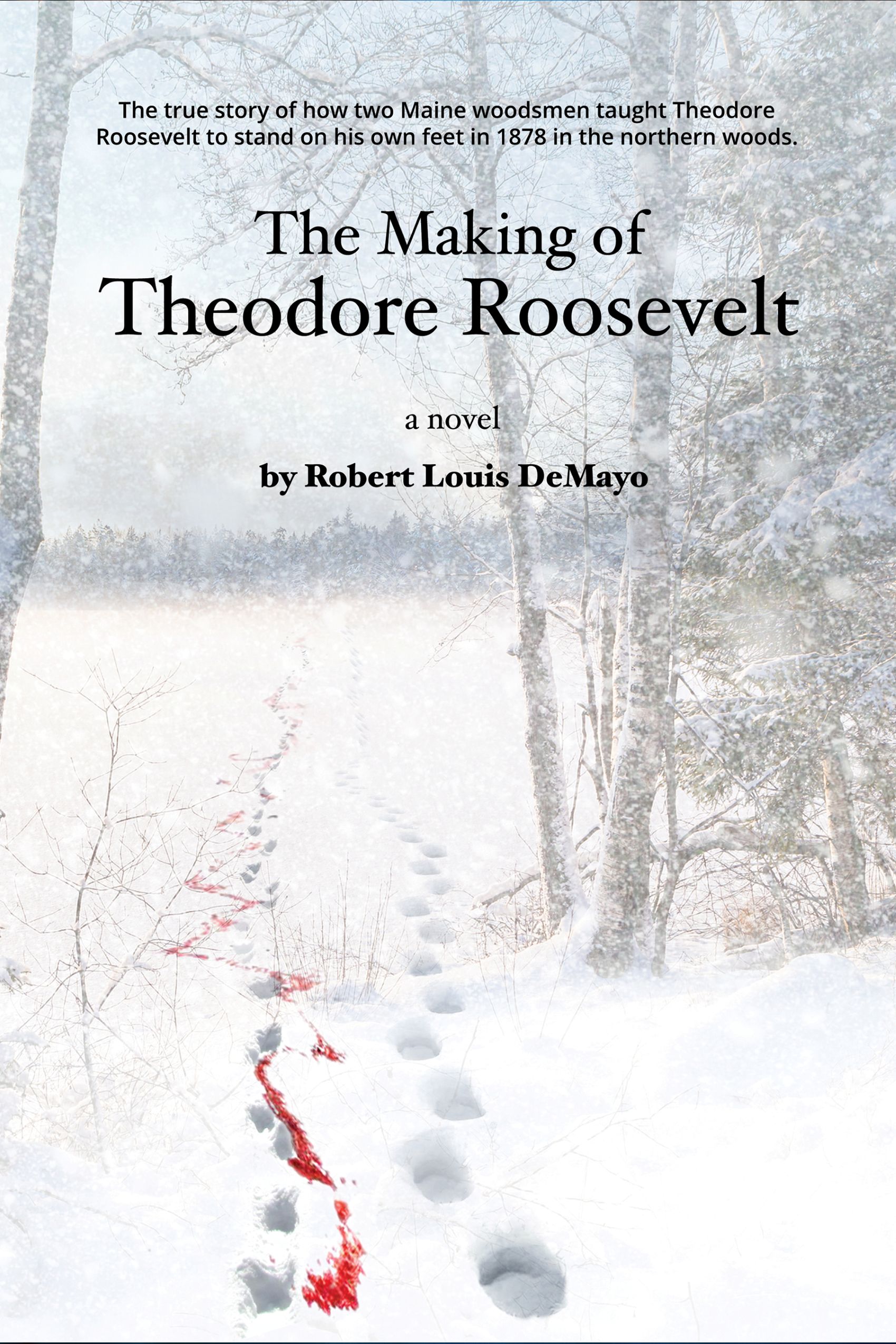
The original cover for The Making of Theodore Roosevelt had real strengths. Its snowy landscape, fading tracks, and blood trail created atmosphere and suggested danger, hardship, and story. But as a thumbnail, it was too subtle, and the typography and overall design failed to convey what made the novel unique.
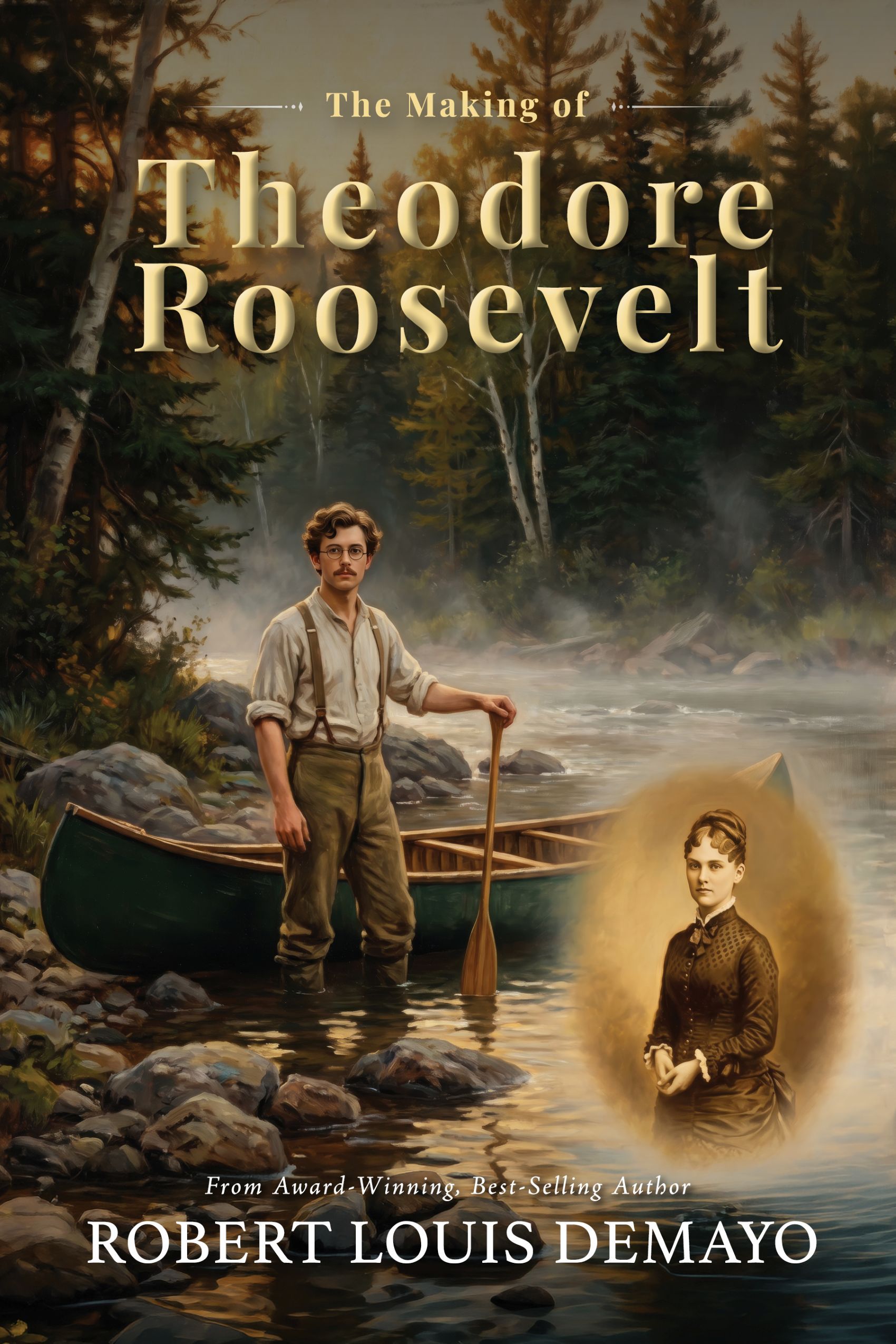
What became clear in the redesign process was that this book was not simply historical fiction about Theodore Roosevelt’s time in Maine. It is also a coming-of-age story and a romance, with Alice, his first wife, playing an important role in its emotional world. The new cover made it possible to express those themes more clearly and more accurately.
Original Cover (2011) - The original cover told a story I still like. The snow, the tracks, and the blood trail created tension and mystery, giving the book a stark, dramatic mood. It was evocative, but it asked too much of the viewer, especially at a small size.
The larger problem was that it did not show enough of what was distinctive about the novel. The typography was not helping, and the cover did not signal Theodore Roosevelt himself, the coming-of-age arc, or the importance of Alice in the story.
Redesigned Cover (2026) - The redesigned cover is much more specific about the story the book tells. By showing a young Theodore Roosevelt in the Maine landscape and including a small portrait of Alice, it immediately brings character, relationship, and historical setting into focus.
It also has a stronger visual hierarchy and works better as a thumbnail. More importantly, it reflects the book more truthfully—not just as historical fiction, but as a story of youth, love, growth, and transformation
Cover Redesign: The Legend of Everett Ruess
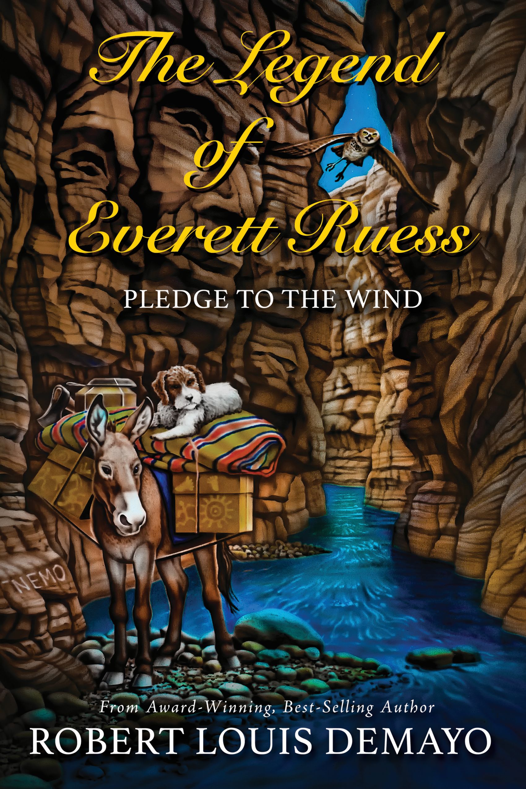
The Legend of Everett Ruess is a work of historical fiction about his life and is the only one supported by his descendants. The original cover was full of details that Everett Ruess fans would recognize — Curly, the burros, the narrows, “NEMO” carved on a rock, and even faces hidden in the canyon walls — and I still like that it tried to honor those elements.
What it did not do was communicate clearly at a glance. At thumbnail size, the image became busy rather than focused, and the fonts and overall design did not create the kind of presence I wanted for the book. The redesign gave me a chance to step back from the fan-specific references and aim for a cover that better captures Everett’s legend and the emotional and exploratory heart of the story.
Original Cover (2014) - The original cover was built almost as a love letter to Everett Ruess devotees. Curly, the burros, the canyon narrows, “NEMO” on the rock, and the hidden faces in the stone all reward close looking and knowledge of the Ruess story. It is rich with detail and has its own charm. The problem is that it asks the viewer to know too much, too quickly.
At a small size, those references blur together, the composition feels crowded, and the typography does not help guide the eye or convey the tone of a serious, descendant-supported historical novel. It became a cover that meant more to insiders than to new readers discovering Everett for the first time.
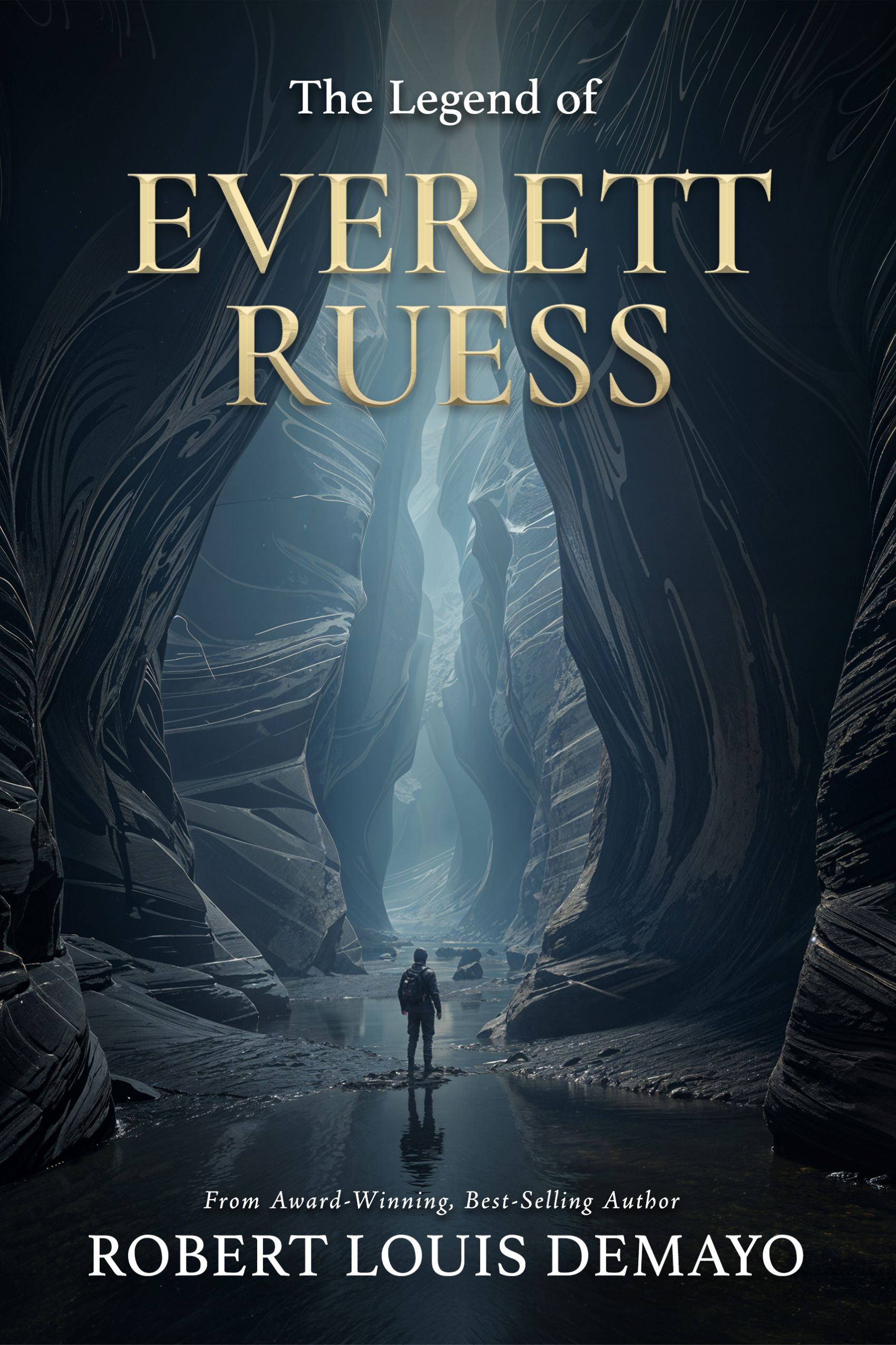
Redisigned Cover (2026) - The new cover moves in a more focused and evocative direction. By placing a lone figure in a towering canyon, it emphasizes solitude, mystery, and the pull of the desert—themes that sit at the heart of Everett Ruess’s legend. The cleaner composition and stronger typography read much better at thumbnail size and feel more aligned with a literary, historically grounded novel.
Instead of depending on a cluster of small references, this design invites readers into the space Everett loved and disappeared into, hinting at both adventure and enigma. It still honors the spirit of the Ruess story, but it does so with a clearer, more iconic image that works for devoted fans and new readers alike.
Where this process can lead
Once the categories, keywords, and copy are aligned, the visual direction usually becomes much clearer. From there, I can help develop a new front-cover concept, shape the supporting copy and bio, and create the image that guides the next stage of the design.
For some authors, that is enough to hand off to a designer. For others, the process can continue into templates and finished, print-ready covers for hardcover, paperback, ebook, and audiobook editions. The level of support depends on the project and how far you want to take it.
If you’d like help applying this kind of positioning and cover exploration to your own work,